
Best Font for Email Marketing: Enhance Your Campaign
Choosing the right font can boost your email marketing success. Fonts affect readability and influence your brand’s perception.
In today’s digital world, first impressions matter. The font you use in your emails can make or break your message. A well-chosen font enhances clarity and draws attention. It shapes how recipients view your content. With so many fonts available, finding the perfect one is challenging.
Each font tells a different story and evokes distinct emotions. Understanding the impact of fonts is crucial for email marketing. This guide explores how fonts affect engagement. Discover how to pick the best font to enhance your email campaigns. Dive into the details and elevate your email strategy with the right choice.
Credit: www.maildesigner365.com
Importance Of Font In Email Marketing
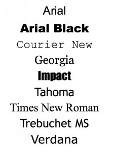
Choosing the right font in email marketing can greatly impact readability and engagement. Fonts like Arial and Verdana are easy to read and look professional, ensuring your message is clear and effective. A good font choice helps readers focus on your content without distraction.
The font you choose for your email marketing campaigns plays a crucial role in how your message is received and understood. It’s not just about aesthetics; the right font can significantly impact readability, engagement, and overall effectiveness. Choosing the best font can be the difference between your email being read or being ignored. So, how do fonts affect your email marketing success?Impact On Readability
Readability is the first hurdle your email must overcome. Fonts that are too fancy or small can make your message difficult to read. Think about your own experience—how often have you skipped reading an email because the text was hard to decipher? A clear, simple font ensures your readers can quickly grasp your message. Fonts like Arial, Verdana, and Helvetica are popular choices for their clarity. They make it easy for the eye to scan and absorb the content. If your audience has to squint or zoom in, they might not bother reading at all. Keep your font size around 14-16px for optimal readability. This way, your message is accessible to all, including those on mobile devices.Influence On Engagement
The right font can also boost engagement. A font that aligns with your brand’s tone can make your message more relatable. Have you noticed how a playful font can make an email feel more light-hearted and inviting? Conversely, a professional font can convey seriousness and trust. If you’re a financial advisor, for instance, a traditional font like Times New Roman might resonate better with your audience. Consider using bold or italics to emphasize key points. But, overdoing it can clutter your email, so use these features sparingly. The goal is to highlight important information without overwhelming the reader. When you choose a font that enhances your message’s tone, your audience is more likely to engage. They might reply, click on a link, or even share your email. Isn’t that what you aim for with every campaign? In your next email marketing campaign, take a moment to think about your font choice. Does it make your message easy to read? Does it encourage engagement? The right font can be a powerful tool in your marketing arsenal.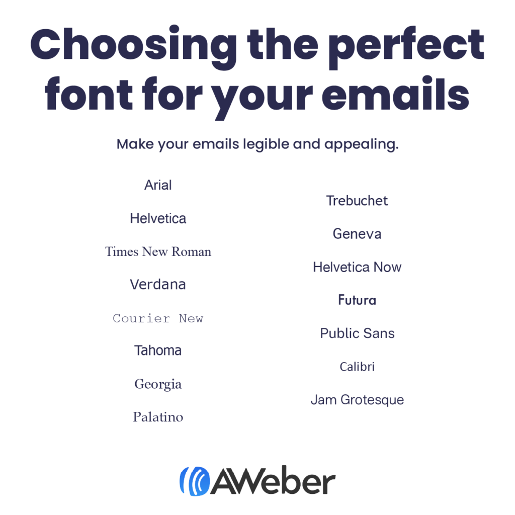
Credit: blog.aweber.com
Choosing The Right Font
Selecting the ideal font for email marketing enhances readability and engagement. Fonts like Arial and Verdana are clear and easy to read. They ensure your message is accessible to all recipients. A simple, clean font keeps readers focused on your content.
Choosing the right font for email marketing is crucial. It affects readability and impacts engagement. A good font captures attention and enhances the message. It sets the tone and reflects the brand’s personality. Selecting an appropriate font requires careful consideration.Factors To Consider
Font size and style matter. Readability is key for effective communication. Consider the audience’s age and preferences. Choose fonts that are easy on the eyes. Compatibility across devices ensures consistent presentation. Test fonts on different screens to check clarity. Choose web-safe fonts for reliability. Avoid fonts that are too fancy or hard to read.Font Pairing Tips
Pair fonts wisely for a harmonious look. Use contrasting styles for emphasis. Combine serif and sans-serif fonts for balance. Choose a primary font for headings. Select a complementary font for body text. Maintain consistency throughout the email. Limit font variety to keep it simple. Ensure the fonts match the brand’s voice.Popular Fonts For Emails
Choosing the right font can make or break your email marketing. Fonts set the tone for your message. They can affect readability and engagement. Popular fonts help create a professional look. They ensure your emails are easy to read. Let’s explore some popular font choices.
Sans Serif Options
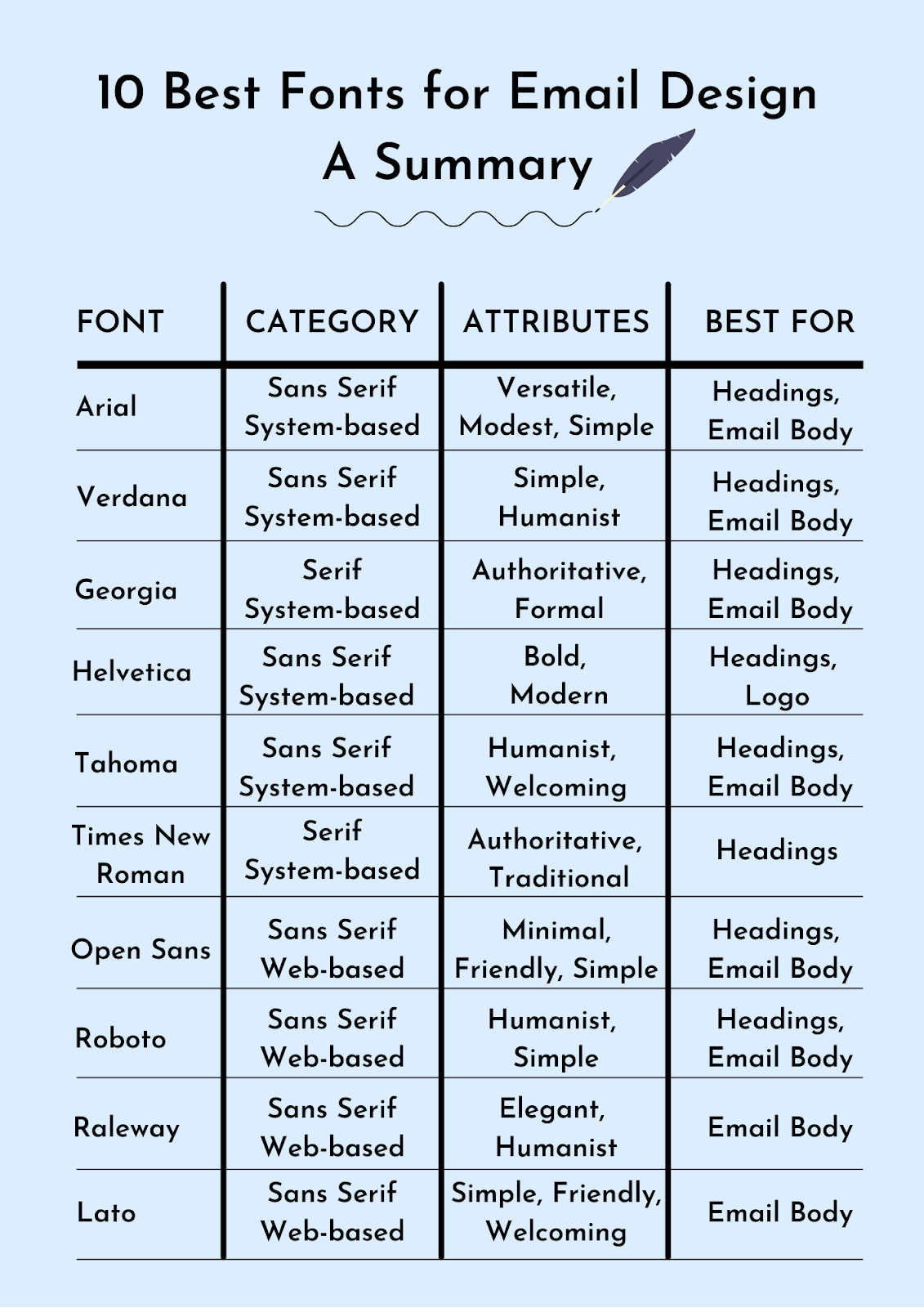
Sans serif fonts are clean and modern. They lack the small lines at the end of strokes. Arial is a popular choice. It’s simple and widely recognized. Verdana offers good readability on screens. Its larger size makes it accessible. Helvetica is another favorite. It has a neutral and modern feel. These fonts are great for clear communication.
Serif Options
Serif fonts have small lines at the ends of letters. Times New Roman is a classic choice. It conveys a traditional and formal tone. Georgia is another serif font. It combines elegance with readability. This font works well for longer emails. Cambria is also worth mentioning. It offers a professional appearance. These fonts add a touch of sophistication.
Fonts For Different Industries
Choosing the best font for email marketing can make your message clear and engaging. Fonts like Arial and Verdana are easy to read and help your emails look professional. A clean font ensures your message stands out, keeping readers interested and informed.
Choosing the right font for your email marketing can significantly impact how your message is perceived. Different industries have distinct preferences and expectations when it comes to fonts. Understanding these nuances can help you craft emails that resonate with your audience and enhance your brand’s credibility. ###E-commerce Preferences
In the fast-paced world of e-commerce, clarity and readability are key. Fonts like Arial and Verdana are popular because they are clean and easy to read on screens. Shoppers appreciate straightforward communication that helps them make quick decisions. When I once received an email from an online store using a fancy script font, it was nearly impossible to read the discount code. This taught me the importance of choosing fonts that prioritize function over flair. Consider using bold fonts for headlines and simple sans-serif fonts for body text to guide your readers effortlessly through the content. ###Corporate Choices
Corporate sectors tend to favor fonts that convey professionalism and trust. Times New Roman and Georgia are often used due to their classic and formal appearance. These fonts can lend credibility to your message and align with the serious tone expected in corporate communication. During my tenure at a financial firm, we experimented with different fonts for our newsletters. Switching from a casual font to Times New Roman resulted in more engagement, as the content felt more authoritative. Think about the message you wish to convey. Is it reliability, innovation, or tradition? Your font choice should reflect this. Don’t be afraid to test different fonts and gather feedback to find what works best for your audience. By selecting the right font, you not only enhance readability but also subtly communicate your brand’s values. What do your current font choices say about your business?Responsive Fonts For Mobile
Choosing the right font for mobile emails is crucial. Mobile users expect clarity and readability. Responsive fonts ensure your message is easy to read on any device. They adapt to different screen sizes, providing a seamless experience.
Scalability Features
Scalable fonts adjust automatically to screen size. This helps maintain readability on various mobile devices. Whether on a smartphone or tablet, scalable fonts keep your text clear. They prevent text from being too small to read.
Cross-device Compatibility
Cross-device compatibility ensures your font looks good everywhere. Emails should look the same on iPhones, Androids, and tablets. Compatible fonts keep your design consistent. This consistency boosts your email’s professional appearance.
Credit: unlayer.com
Typography And Brand Identity
Typography plays a crucial role in shaping brand identity. The font chosen for email marketing can significantly impact how a brand is perceived. Selecting the right typography helps convey the brand’s message clearly. It ensures that the emails resonate with the target audience. A well-chosen font reflects the brand’s values. It enhances the overall communication strategy.
Consistency With Brand
Maintaining consistency with brand fonts strengthens identity. Consistent typography across emails builds trust. It ensures that the message aligns with the brand’s voice. Customers recognize the brand instantly when they see familiar fonts. This familiarity reinforces brand loyalty. It creates a cohesive experience for recipients.
Enhancing Brand Recognition
Typography is key in enhancing brand recognition. A unique font makes the brand stand out in crowded inboxes. It captures attention quickly and leaves a lasting impression. Consistent use of a distinct font increases recall. Recipients associate the typography with the brand. They remember the brand even after reading the email.
Testing And Optimization
Testing and optimization are crucial in finding the best font for your email marketing campaigns. It’s not just about choosing a font that looks good. It’s about ensuring it performs well and resonates with your audience. Have you ever sent an email and wondered if a different font might have caught more eyes? Testing can provide the answers, and optimization can turn those insights into results.
A/b Testing Methods
A/B testing is a powerful tool for evaluating different fonts in your emails. You create two versions of your email – one with Font A and another with Font B. Then, you send them to different segments of your audience. Observe which version gets more opens, clicks, or conversions. This method helps you understand which font resonates better with your readers.
Consider testing fonts that are already popular in your industry. You might be surprised to find that a font you’ve never used before performs better than your current choice. By comparing different fonts side-by-side, you gain insights into how subtle design changes can impact reader engagement.
Analyzing Font Performance
Once you’ve tested your fonts, it’s time to dive into the results. Look at metrics like open rates, click-through rates, and overall engagement. Which font made your audience take action? Numbers tell a compelling story, revealing preferences and behaviors.
But don’t stop at the numbers. Think about the context. Did the font match your brand’s tone? Was it easy to read on mobile devices? These qualitative factors can play a significant role in how your audience perceives your message. A font might perform well in one campaign but fall short in another.
Remember, the goal is not just to find a font that works but to refine your approach continually. What insights have you gained from your testing? Are there fonts that consistently perform well? Use this knowledge to optimize future campaigns.
Testing and optimization aren’t just technical tasks; they’re about understanding your audience better. What do they respond to? How do they engage with your content? These questions lead you to a font choice that enhances your email marketing strategy, making your messages not only seen but acted upon.
Legal And Accessibility Considerations
Email marketing requires careful consideration of legal and accessibility aspects. Choosing the right font is crucial for compliance and inclusivity. Ensuring emails are accessible to all audiences is essential. This includes people with visual impairments. It also involves adhering to legal standards. Let’s explore these considerations further.
Compliant Font Usage
Email marketing must follow certain legal standards. Fonts should be legible and widely recognized. This helps in maintaining compliance with regulations. Avoid fonts that mimic copyrighted designs. Using standard fonts like Arial or Times New Roman is safe. They are universally accepted and easy to read. Compliance helps avoid potential legal issues. It also builds trust with your audience.
Fonts For Accessibility
Accessibility is a key aspect of email marketing. Fonts should be clear and readable. Sans-serif fonts are often recommended. They are easier to read on digital screens. Examples include Arial and Verdana. These fonts work well for people with visual impairments. Font size is also important. A minimum of 12-point size is recommended. This ensures text is readable for all recipients. Use a high contrast between text and background. It enhances readability for visually impaired users.
Conclusion
Choosing the right font impacts your email marketing success. It makes your message clear and inviting. Fonts like Arial or Verdana work well. They are easy to read and professional. Test different fonts to see what your audience likes. Keep your design simple and clean.
Avoid fancy fonts that confuse. Consistency in font style builds trust. Remember, the right font enhances your content. It helps your email stand out. Engage your readers with clarity. Your choice matters in delivering your message effectively.